Dialpad (dot com)
Dialpad was undergoing a rebranding effort and I was brought on to help establish the website design library as well as refresh the website from the ground up.
Role
Senior Web Designer
Agency
Dialpad, in-house
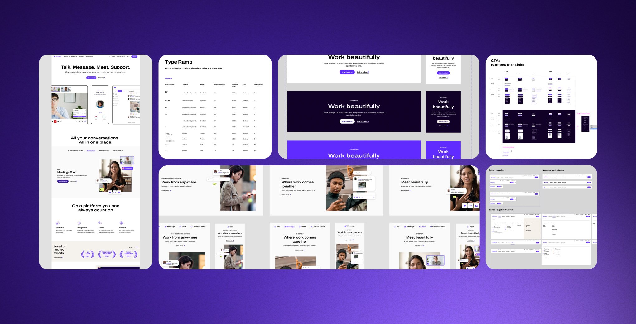
Parts of the Dialpad design system
The System
Dialpad (dot com) was about to undergo a major rebuild in conjunction with a rebrand. The design library was built within a tight timeline with flexibility in mind for future fine-tuning and expansion. Collaborating across marketing teams we built modules to elevate content and provide clear user journeys across the site. The grid system, type ramp, color palette and CTA’s provided solid building blocks to amplify the product and work responsively across viewports.

Responsive modules to support a variety of content types

Example of a module to live site use
Breathing Room
Smart use of whitespace across the site allowed the succinct large headlines and layered graphics to do the heavy lifting for content communication. Dialpad brand purple was used as a highlight and primarily within call-to-actions to create a balanced visual space. Additional light tones of off-white and gray were introduced to support but not overwhelm site content.


Asset Creation
Just as the visuals were built from the ground up the visual assets were also completely new. In collaboration with the content team we created a visual system for showing the Dialpad app and sourced imagery across the site.
App screen focus
App across devices
APP UI elements over imagery

Visual asset system